
Digital & IT · Operational + Embodied Energy
Email & Digital Habits Carbon Footprint Calculator — Per-Email, Per-Person & Team Emissions
Estimate the carbon footprint of email using a bottom-up, segment-level model built on the Sustainable Web Design Model v4 — data-centre, network, and device energy per gigabyte transferred, an optional on-screen attention layer, and a user-selectable grid factor. Reports per email, per person per year, or whole-team per year, with an audit view that stamps the exact data release behind every number.
What the calculator computes. The footprint of an email is the energy consumed moving and displaying its bytes, multiplied by the carbon intensity of the electricity that powers each stage. There is no single “email emission factor” in the data layer — the engine composes the figure bottom-up from published per-gigabyte energy intensities and, optionally, from device power draw during the time you spend reading. This is the same segment-model approach the web page-view methodology uses, applied to the payload of an email rather than a page.
The transmission model (default). Every email transfers data across three segments — the data centre that stores and sends it, the network that carries it, and the user device that downloads and renders it. The Sustainable Web Design Model v4 assigns an operational and an embodied energy intensity to each segment, in kilowatt-hours per gigabyte. The calculator sums the six intensities into three per-segment figures — data centre 0.067, network 0.072, and device 0.161 kWh/GB (operational plus embodied) — multiplies each by the email’s data volume, and applies the selected grid factor to convert kilowatt-hours to grams of CO₂e.
The attention layer (optional). The bytes are only part of the story. The electricity a laptop, phone, or desktop draws while a message sits open on screen frequently exceeds the transmission energy by an order of magnitude. When the attention layer is enabled, the calculator adds device operational power — a laptop at 22 W, a desktop tower plus monitor at roughly 118 W, a tablet at 5.5 W, a smartphone at 1 W — multiplied by the seconds of reading time and the grid factor. On a typical read this term dominates the result, which is the single most important thing this page has to teach.
The grid factor. Operational and attention energy are both converted to CO₂e using a user-selectable grid factor. The default is a global average of 494 gCO₂e/kWh. Selecting the United Kingdom applies the DEFRA 2026 location-based grid factor of 0.131 kg CO₂e/kWh; the United States applies the eGRID 2023 national factor; roughly 200 further countries resolve through Ember 2025 electricity data. The grid row carries its own greenhouse-gas basis (DEFRA and eGRID full CO₂e; Ember CO₂-only), so there is no separate GWP toggle.
Optional embodied-device and storage layers. Two further opt-in layers extend the boundary. An embodied-device sub-toggle amortises the manufacturing carbon of the reading device (a laptop at 200 kg CO₂e cradle-to-distribution, a smartphone at 50 kg) across its useful life and active hours. A storage layer estimates the standing energy of a retained mailbox from its size in gigabytes and a storage tier — hot SSD at 10.52, nearline or object disk at 5.70, cold archive at 0.50 kWh per terabyte-year, with a 1.5× data-centre overhead applied. Both are off by default because both are small relative to attention on almost every realistic input.
What is out of scope. The model covers the operational and embodied energy of moving, displaying, and storing an email. It does not model spam-filter compute (the “emails received” input is the count after filtering), the embodied carbon of network infrastructure beyond the SWD segment allowance, or the personal-lifestyle emissions of the people sending and reading. Results are estimates for awareness and prioritisation, not an assurance-grade inventory line.
Transmission-only is the defensible headline. Attention time reproduces the folkloric per-email figures — it is an attribution choice, surfaced here rather than buried.
Loads live from MasterBrain. A clean grid (France/Nordics) vs a coal-heavy grid moves the result several-fold.
Enter an email size (and daily volume, for a yearly figure) to calculate
Results appear instantly: a defensible transmission footprint, an optional attention-time layer, the data-centre / network / device / attention / storage split, physical + literature comparators, and the full audit trail. Each factor is tagged MasterBrain-live or page-pinned.
Results are indicative digital-carbon emissions for email, computed on a two-layer model. Transmission allocates the bytes moved across data centre, network and the receiving device using the Sustainable Web Design v4 per-GB energy intensities × the selected grid — the defensible, sub-gram-per-email figure. Attention time (opt-in) additionally attributes the reader/composer’s device power over the time spent; this reproduces the widely-quoted ~4 g / ~50 g email figures but is an attribution choice, not a physical fact — always state which layers you included. Grid factors, SWD per-GB intensities, device power, device embodied and storage intensity are read live from MasterBrain; the device useful-life / active-hours amortisation, storage PUE, and the physical + literature comparators are page-pinned with citations, each tagged in the audit trail. International grids (Ember 2025) are CO₂-only; UK (DEFRA) and US (eGRID) are full CO₂e. Email does not map cleanly to one GHG Protocol scope — report it as a digital-carbon estimate. Spam-filter compute, end-of-life, and content the message links to are out of boundary. This is a transparent attributional estimate, not metered telemetry; confirm volumes and grid factors against your own records, and where material proceed to third-party verification.
The carbon footprint of an email is the most argued-over number in digital sustainability. Popular figures range from a hundredth of a gram to fifty grams for the “same” message, and almost every viral statistic about deleting your inbox to save the planet is built on the wrong end of that range. The disagreement is not sloppiness — it is a real question about where you draw the boundary.
On most reads, the electricity your screen draws while you look at the message matters far more than the bytes it took to deliver.
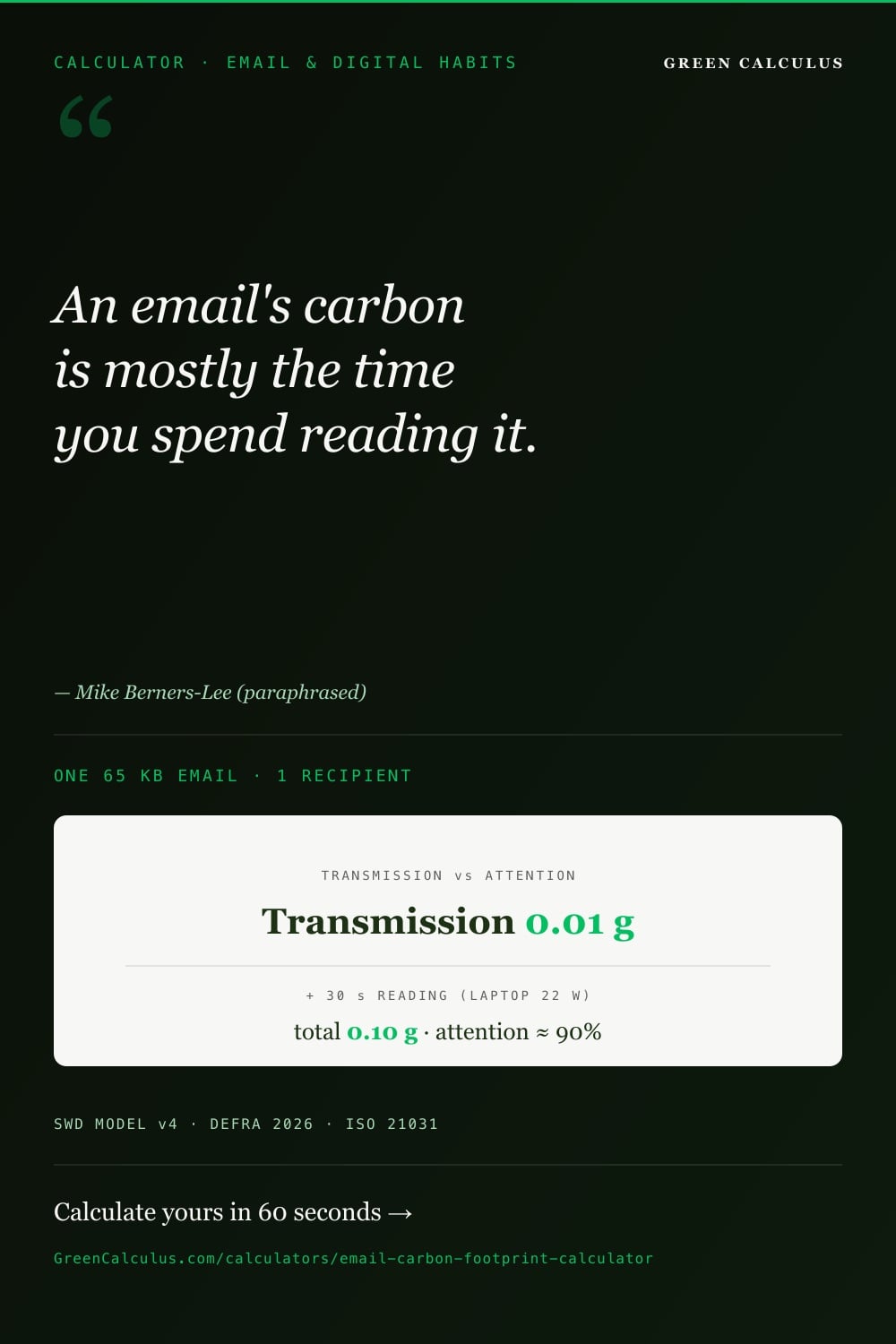
A plain email’s transmission footprint is a fraction of a gram of CO₂e — roughly 0.01 g for a short message. Counting the electricity your device draws while you read it typically pushes the total to about 0.1 g, with reading time, not data volume, driving most of that.
What this calculator measures

This calculator estimates the greenhouse-gas emissions attributable to email: the electricity used to store, transmit, display, and optionally retain a message, converted to grams of CO₂e using the carbon intensity of the electricity supply. It answers the footprint at three levels — a single email, one person’s annual email, or a whole team’s annual email — and separates the two things that popular “email carbon” figures usually blur together: the energy of moving the bytes, and the energy of a person sitting in front of the message.
That separation is the reason the tool exists. A short email might transfer only tens of kilobytes, and the electricity to shift those bytes across a data centre, a network, and onto a screen is genuinely tiny — a hundredth of a gram of CO₂e is a defensible figure. But the same email held open on a laptop for thirty seconds draws far more electricity through the screen and processor than the transfer ever did. Depending on where you draw the line, the “footprint of an email” changes by a factor of ten or more, and both numbers are correct for the boundary they describe.
Two attribution modes, one honest distinction
Transmission only (default)
Counts the energy to store, carry, and download the message — the data-centre, network, and device energy tied to the bytes themselves. This is the narrowest defensible boundary and the one most comparable across studies. A short plain email lands at roughly 0.01 g CO₂e here.
Transmission + attention
Adds the electricity the reading device draws during the time the message is on screen. On a typical thirty-second read this term is around ninety per cent of the total, taking a short email to roughly 0.1 g CO₂e. It is the more complete picture of what email actually costs a person.
The headline finding of this page is that on most reads, attention time — not data volume — is where email carbon lives. The bytes are a rounding error next to the electricity a screen draws while a person looks at the message. Any figure that counts only transmission is describing the delivery van, not the whole journey; any figure that ignores attention will understate a real inbox by roughly an order of magnitude.
How email carbon is calculated
The engine does not look up a single “grams per email” constant. It builds the figure from the ground up out of published energy intensities, so the same model transparently scales from a one-line reply to a 25 MB attachment and adapts to whichever electricity grid powers the read. There are two calculation chains — transmission and attention — and the result is their sum.
The SWD v4 boundary — data centre, network, device, times operational and embodied
The transmission chain uses the Sustainable Web Design Model v4, the same per-byte framework behind the website digital carbon calculator and the video streaming and conferencing calculator. SWD v4 divides the internet’s energy into three physical segments and, within each, an operational share (the electricity to run the equipment) and an embodied share (the manufacturing carbon of that equipment, amortised per gigabyte carried). Six intensities in total, which the calculator sums into three per-segment figures.
Data centre — 0.067 kWh/GB
The servers that store the mailbox and send the message. Operational 0.055 plus embodied 0.012 kWh per gigabyte. The smallest of the three segments for a plain email, because the payload rarely touches heavy compute.
Network — 0.072 kWh/GB
The fixed and mobile infrastructure carrying the bytes from the data centre to the reader. Operational 0.059 plus embodied 0.013 kWh per gigabyte. Scales directly with payload, so attachments move this term most.
User device — 0.161 kWh/GB
The download and rendering energy on the reader’s own hardware, per gigabyte. Operational 0.080 plus embodied 0.081 kWh per gigabyte — the largest transmission segment, and a preview of why the device dominates once attention time is added.
Each per-segment intensity is multiplied by the email’s data volume in gigabytes, and the resulting kilowatt-hours are converted to grams of CO₂e using the selected grid factor. For a 65 KB email that is 0.000065 GB across each segment — genuinely small numbers, which is exactly why transmission alone understates the felt cost of email.
The attention layer — why on-screen time can be ninety per cent of the number
When the attention layer is enabled, the calculator adds a second term with nothing to do with bytes: the reading device’s operational power draw, multiplied by the seconds the message is on screen, converted at the grid factor. A laptop draws about 22 W, a desktop tower with monitor about 118 W, a tablet 5.5 W, a smartphone 1 W. These figures come from the same device dataset behind the end-user devices calculator.
The arithmetic makes the dominance concrete. A laptop at 22 W held on a message for thirty seconds consumes 0.022 kW × (30 ÷ 3600) h = 1.83×10⁻⁴ kWh. At the 494 gCO₂e/kWh global default that is 0.091 g — against roughly 0.0096 g for the entire transmission chain of the same email. The screen, in other words, accounts for about ninety per cent of the total. Longer reads, brighter or larger displays, and desktop hardware all push that share higher.
One 65 KB email, one recipient, global-average grid (0.494 kg CO₂e/kWh). Transmission chain first, then the attention term, reproducible against MasterBrain v2026.26.
| Component | Data / power | Energy | × grid | gCO₂e |
|---|---|---|---|---|
| Data centre | 0.000065 GB × 0.067 kWh/GB | 4.36×10⁻⁶ kWh | ×0.494 | 0.00215 |
| Network | 0.000065 GB × 0.072 kWh/GB | 4.68×10⁻⁶ kWh | ×0.494 | 0.00231 |
| Device (download) | 0.000065 GB × 0.161 kWh/GB | 1.05×10⁻⁵ kWh | ×0.494 | 0.00517 |
| Transmission subtotal | — | 1.95×10⁻⁵ kWh | — | ≈ 0.0096 |
| Attention (laptop 22 W, 30 s) | 0.022 kW × (30 ÷ 3600) h | 1.83×10⁻⁴ kWh | ×0.494 | 0.091 |
| Total (transmission + attention) | — | — | — | ≈ 0.10 |
Per-email CO₂e = Σ(segment kWh/GB × GB) × grid + Σ(device kW × read-hours × grid)
The attention term is roughly ninety per cent of the 0.10 g total. That is not an artefact of this example — it is the general shape of email carbon whenever a human actually reads the message.
Attachments, recipients, and reply-all
Three inputs move the transmission chain in ways worth understanding. Attachment size is the largest lever on the byte side: a 5 MB attachment is roughly eighty times the payload of a plain 65 KB email, and it scales the data-centre, network, and device transmission terms proportionally — though even then a single on-screen read usually outweighs it. Recipients multiply the transmission chain once per delivery, because each copy is stored, carried, and downloaded separately; a message to fifty people transmits fifty times, even though the sender composed it once. Reply-all is simply the recipient multiplier applied to a thread, which is why long distribution lists, not long messages, are where transmission volume accumulates.
Email emission benchmarks — and why the numbers disagree
Search for the carbon footprint of an email and you will find figures spanning two orders of magnitude, often cited side by side without explanation. The spread is not measurement error. It is the visible result of different studies drawing the boundary in different places — and understanding the boundary is more useful than memorising any single number.
The most-cited band, and its caveat
The best-known figures come from Mike Berners-Lee’s 2020 estimates, which are widely reproduced as the definitive “email carbon” numbers. They are useful as a shape, provided they are read as what they are — a set of illustrative bands for different message types, sensitive to the attribution choices behind them, not the output of this calculator.
| Message type | Cited figure (Berners-Lee 2020) | What it broadly represents |
|---|---|---|
| Spam (filtered, unread) | ≈ 0.03 g CO₂e | Machine-handled, never opened — transmission and filtering only |
| Short genuine email | ≈ 0.3 g CO₂e | A brief message, sent and read |
| Typical email | ≈ 4 g CO₂e | A longer message with a meaningful read time |
| Email with a large attachment | ≈ 26 g CO₂e | Substantial payload plus reading and handling |
Do not treat the Berners-Lee band as a factor to multiply your inbox by, and do not compare it directly to this calculator’s output. Those figures fold reading time, device assumptions, and older grid intensities into single headline numbers, and the grids of 2020 were substantially dirtier than today’s. This tool exposes each component separately and lets you pick a current grid factor, so its transmission-only figure is far below the band and its transmission-plus-attention figure depends on the read time and device you specify. They answer subtly different questions; the band is shown here as context, not as a target.
Where the divergence actually comes from
Four boundary choices explain almost all of the disagreement between published email figures. First, whether attention time is counted at all — the single biggest fork, worth roughly a factor of ten. Second, the grid intensity assumed: a 2020 global average against a 2026 decarbonised national grid can differ by a factor of three or more. Third, whether embodied device and infrastructure manufacturing is amortised in or left out. Fourth, how recipients and storage are handled — per-delivery or per-message, mailbox retained or ignored. A calculator that hides these choices produces a tidy single number; one that surfaces them, as this one does, produces a defensible range and tells you which lever moved it.
Inputs this calculator needs — and where to source them
The calculator works at whatever level of detail you have. A single field — average email size — produces a per-email estimate; a handful more scales it to a person or a team. The inputs below map one-to-one onto the live tool.
| Input | Applies to | Where to source it |
|---|---|---|
| Basis — per email, per person/year, or whole team/year | All | Your choice of reporting granularity |
| Attribution — transmission only, or + attention time | All | Transmission for a conservative floor; add attention for the realistic total |
| Average email size (KB or MB) | All | Mail-server reporting, or a typical 50–100 KB for plain text |
| Recipients per email | Per email | Count of deliveries, not the compose count |
| Emails sent / received per day, working days/year | Per person, team | Mail-client statistics; “received” is the post-filter count |
| Headcount | Team | Number of mailboxes in scope |
| Grid — global default, UK, US, or ~200 countries | All | The country powering the reads; global average if mixed or unknown |
| Device and time per email (seconds) | When attention is on | The reading device and a realistic on-screen duration |
| Advanced — % with attachment, avg attachment size, recipients per sent email, embodied-device toggle, result view, storage toggle + mailbox size + tier | Optional | Mail-server analytics; leave off for a transmission-and-attention baseline |
There is deliberately no spam input. The “emails received” figure is the count after your provider’s filtering, and the compute spent by the spam filter itself is out of scope — it belongs to the mail platform’s own infrastructure footprint, not to your inbox. If you want a whole-organisation digital number, pair this with the data-centre PUE calculator rather than trying to force filtering into the email figure.
Switching the result view to Audit stamps the MasterBrain data version and a calculation hash into the result footer, so any figure you quote in a report can be pinned to an exact factor release and reproduced later — the same provenance discipline the software carbon intensity calculator applies to its outputs.
Email vs other digital habits
Email is one thread in a person’s digital footprint, and usually a small one. Placing it next to the habits that share its infrastructure — the same data centres, networks, and devices — helps calibrate where attention is worth spending. Each of the calculators below models its own activity in its own natural unit, so the honest comparison is structural rather than a single shared number.
| Digital habit | Dominant driver | Rough relative intensity | Model / calculator |
|---|---|---|---|
| Plain email (transmission) | Bytes transferred | Lowest — hundredths of a gram | This calculator (SWD v4) |
| Email read (with attention) | Device on-screen time | Low — around a tenth of a gram per read | This calculator (SWD v4 + device power) |
| Web page view | Page weight + render | Higher than a plain email — heavier payloads | Website digital carbon calculator |
| Video streaming / conferencing | Sustained high-bitrate transfer + screen time | Far higher — continuous data over minutes or hours | Video streaming calculator |
| AI search query | Inference compute | Higher per action than a plain email | AI search carbon calculator |
| Cloud storage (standing) | Idle drive energy over time | Very low per gigabyte-year — accumulates only at scale | Cloud storage carbon calculator |
The pattern that emerges is consistent: activities that hold a screen active for sustained periods — video calls above all — dwarf the transactional ones like sending an email. It is the reason a single hour-long video meeting can outweigh a month of plain email, and why time-on-device is the through-line across the whole digital cluster.
What actually reduces email emissions
Because attention dominates transmission, the interventions that actually move an email footprint are rarely the ones that go viral. The list below is ordered by real effect, and it starts by retiring the most popular myth.
Deleting old emails to “save carbon” achieves almost nothing. Stored email is a standing energy cost measured in single-digit kilowatt-hours per terabyte-year — a mailbox of ordinary size is a rounding error, and the delete action itself consumes energy. The footprint of email lives in sending, receiving, and above all reading, not in storage. Inbox-cleanup campaigns are a feel-good gesture aimed at the smallest term in the model.
Send fewer, to fewer people
The highest-leverage change. Every recipient is a separate transmission and, more importantly, a separate potential read. Trimming reply-all, oversized distribution lists, and low-value “thanks” messages cuts both the byte term and the far larger attention term at once.
Shrink and unlink attachments
Large attachments are the main lever on the transmission side, multiplied by every recipient. Linking to a shared file instead of attaching it sends the payload once and only to those who open it, rather than to every mailbox on the list.
Read on efficient hardware
Since attention is device power × time, the reading device matters. A laptop or phone draws a fraction of a desktop-plus-monitor’s power. Where a choice exists, lower-power hardware directly shrinks the dominant term.
Decarbonise the grid behind the read
Every gram in the model is energy times grid intensity. A read on a low-carbon grid can emit a third of the same read on a fossil-heavy one. This is the structural lever — and the reason today’s figures sit well below the widely cited 2020 numbers.
The uncomfortable conclusion for anyone hoping email is a meaningful climate lever is that the single most effective personal action is not about email at all — it is fewer, shorter screen-based interactions overall, on cleaner power. Email discipline helps at the margin; it is not where an organisation’s decarbonisation is won.
Email in a corporate GHG inventory
For an organisation reporting under the GHG Protocol, email emissions rarely sit in one clean place — they fragment across scopes depending on who owns the hardware and the electricity. Understanding the split matters less for the tonnes involved (usually negligible) than for classifying them correctly if they are reported at all.
| Segment | Typical scope treatment | Rationale |
|---|---|---|
| Employee devices on company power | Scope 2 | Purchased electricity for owned or controlled equipment |
| Third-party mail platform (cloud) | Scope 3, Category 1 | A purchased digital service — the provider’s data-centre energy |
| Home-working and personal-device reads | Scope 3, Category 7 | Employee electricity outside the organisation’s control |
For almost every organisation, email is immaterial against travel, buildings energy, and purchased goods — often by three or four orders of magnitude. Spend inventory effort where the tonnes are. Email carbon becomes worth a dedicated line only for pure-digital businesses at very large user scale, or as an engagement tool to make abstract digital impact tangible to staff. If you report it, disclose the boundary (transmission only, or with attention) and the grid basis alongside the figure, so a reader can see which of the two very different questions you answered.
Standards and methodology basis
The calculator rests on three published references, each doing a distinct job — one for the per-byte energy, one for the reporting discipline, and one for the electricity conversion.
Sustainable Web Design Model v4
The SWD Model supplies the six per-gigabyte segment intensities — operational and embodied, across data centre, network, and device — that drive the transmission chain. Its underlying energy figures derive from Malmodin 2023 and IEA 2022. It is the same basis used across the digital cluster, so email, web, and streaming results are internally consistent.
ISO/IEC 21031 — Software Carbon Intensity
The SCI specification frames the operational-plus-embodied, energy-times-intensity accounting logic this calculator follows, and the provenance discipline behind the audit view. The paired SCI methodology documents the approach in full.
Grid emission factors
Energy is converted to CO₂e using location-based grid factors: DEFRA 2026 for the UK (0.131 kg CO₂e/kWh), eGRID 2023 for the US, and Ember 2025 for roughly 200 further countries, with a 494 gCO₂e/kWh global average as the default. See the electricity emission factor definition for how these are constructed.
Data sources, factor versioning, and transparency
Every factor the engine multiplies is read live from the MasterBrain data layer, with a page-pinned fallback identical to the live value for deploy safety. The transmission intensities are the SWD v4 segment set below.
| Segment | Operational (kWh/GB) | Embodied (kWh/GB) | Combined (kWh/GB) |
|---|---|---|---|
| Data centre | 0.055 | 0.012 | 0.067 |
| Network | 0.059 | 0.013 | 0.072 |
| User device | 0.080 | 0.081 | 0.161 |
Device operational power for the attention layer runs from a smartphone at 1 W to a desktop tower plus monitor at roughly 118 W (laptop 22 W, tablet 5.5 W). The optional embodied-device layer amortises cradle-to-distribution manufacturing carbon (laptop 200, desktop plus monitor 450, tablet 100, smartphone 50 kg CO₂e) over device life and active hours; the optional storage layer runs from 0.50 kWh/TB-year for cold archive to 10.52 for hot SSD, with a 1.5× data-centre overhead. Grid factors are the DEFRA 2026, eGRID 2023, and Ember 2025 sets described in the previous section.
SWD segment intensities and grid factors update as their sources revise — SWD on its own release cadence, DEFRA each June for the UK. The result footer stamps the MasterBrain version and a calculation hash, so a figure computed against one data release stays distinguishable from the same figure computed against a later one. Any worked figure on this page is reproducible against MasterBrain v2026.26.
Frequently asked questions
A short plain email’s transmission footprint — the energy to store, carry, and download it — is roughly 0.01 g CO₂e on a global-average grid. Counting the electricity your device draws while you read it typically raises the total to around 0.1 g, with reading time driving most of that. There is no single correct figure: it depends on whether you count attention, the grid powering the read, the payload size, and the number of recipients. This calculator exposes each of those so you can produce a defensible number for your own boundary.
Almost imperceptibly. Stored email costs a standing few kilowatt-hours per terabyte-year, so an ordinary mailbox is a rounding error, and the act of deleting consumes energy too. The footprint of email is dominated by sending, receiving, and reading — not storage. Inbox-cleanup campaigns feel productive but target the smallest term in the model. If reducing digital impact is the goal, sending fewer messages to fewer people and spending less time on screen matter far more.
The widely cited 0.3 g / 4 g / 26 g figures come from Mike Berners-Lee’s 2020 estimates, which fold reading time, device assumptions, and the dirtier grids of 2020 into single headline numbers. This calculator separates transmission from attention and lets you select a current grid factor, so its transmission-only figure sits well below the band and its transmission-plus-attention figure depends on the read time and device you enter. The older band is shown on this page as context, not as a target to match — the two answer subtly different questions.
Attention is the electricity your device draws while a message is open on screen — device power multiplied by reading time. It is off by default so the transmission-only figure stays comparable across studies, but on a typical read it is around ninety per cent of the real total. Turn it on for the honest picture of what email costs a person; leave it off only when you specifically want the narrow, byte-only boundary. The dominance of this term is the central point of the whole calculator.
No — and deliberately. The “emails received” input is the count after your provider’s filtering, and the compute the spam filter itself uses is out of scope, because it belongs to the mail platform’s infrastructure rather than to your inbox. If you need a whole-platform digital footprint that includes filtering and back-end compute, model that separately with the data-centre and cloud-compute calculators rather than forcing it into a per-email figure.
Each recipient is a separate delivery — stored, carried, and downloaded independently — so the transmission chain multiplies once per recipient. A message to fifty people transmits fifty times even though it was composed once, and reply-all applies that multiplier across a whole thread. This is why long distribution lists, not long messages, are where transmission volume accumulates, and why trimming recipients is one of the highest-leverage reductions available.
Use the country where the reading actually happens. The default is a 494 gCO₂e/kWh global average; selecting the UK applies the DEFRA 2026 factor of 0.131 kg CO₂e/kWh, the US applies eGRID 2023, and roughly 200 other countries resolve through Ember 2025. If your reads are spread across many countries or you do not know, the global average is the honest default. The grid choice can move the result by a factor of three or more, so state which one you used whenever you quote a figure.
Email fragments across scopes: company-powered devices sit in Scope 2, a third-party cloud mail platform in Scope 3 Category 1, and home-working reads in Scope 3 Category 7. For nearly every organisation the tonnes are immaterial against travel, buildings, and purchased goods, so a dedicated line is rarely warranted. If you do report it, disclose the boundary (transmission only, or with attention) and the grid basis alongside the number so a reader can see which question you answered.
For an individual, no — a year of email is a tiny fraction of the footprint of a single short flight or a few tanks of fuel. Its value is as an entry point: a tangible, everyday example that makes the abstract idea of digital impact concrete. The genuine lesson of the model is broader than email — screen time on clean power is the through-line across all digital activity, and video calls or streaming outweigh email many times over. Treat email as a teaching tool, not a decarbonisation lever.
Methodology notes and limitations
Model basis. Transmission energy uses the Sustainable Web Design Model v4 six-segment per-gigabyte intensities (operational and embodied, across data centre, network, and device), with underlying energy figures from Malmodin 2023 and IEA 2022. Attention energy uses device operational power from the end-user-device dataset. The engine composes the figure bottom-up; it does not apply a single hardcoded per-email constant, and the Berners-Lee band shown in the benchmarks section is a labelled comparator only.
Attention is the dominant, most sensitive term. On any read with a human present, on-screen time typically accounts for the large majority of the total. The result is therefore highly sensitive to the reading time and device you enter — realistic inputs matter far more here than they do for the transmission chain. Transmission-only mode is offered as a conservative, study-comparable floor.
Grid factor. Operational and attention energy are converted at a user-selectable location-based grid factor (global-average default, DEFRA 2026 for the UK, eGRID 2023 for the US, Ember 2025 for other countries). The grid row carries its own greenhouse-gas basis — DEFRA and eGRID as full CO₂e, Ember as CO₂-only — so there is no separate GWP toggle, and CO₂-only country results are marginally lower than a full-CO₂e equivalent would be.
Out of scope. Spam-filter and back-end platform compute (the received count is post-filter), network infrastructure beyond the SWD segment allowance, and the personal-lifestyle emissions of senders and readers are all excluded. The optional embodied-device and storage layers extend the boundary but are off by default because both are small relative to attention on realistic inputs.
Provenance. The Audit result view stamps the MasterBrain data version and a calculation hash into the footer, so any quoted figure can be pinned to an exact factor release and reproduced. Worked figures on this page reconcile against MasterBrain v2026.26.
Not an assurance output. Results are estimates for awareness and prioritisation. They are not a PCAF- or ISAE-grade assurance figure and should not be used as a reported inventory line without practitioner review of the boundary, grid basis, and materiality. For a whole-organisation digital footprint, combine this with the data-centre PUE, end-user devices, and cloud storage calculators rather than relying on email alone.